Repository navigation
feat(app-ui): unified overlay layering, focus and scroll lock; public Portal and hooks - #874
Merged
Merged
Conversation


Preview stand statusDeploying... |

cakeinpanic
force-pushed
the
fix/app-ui-review-3-overlays
branch
from
October 27, 2026 12:37
cf31786 to
e3bc15a
Compare
There was a problem hiding this comment.
🟡 Changes recommended
Unresolved focus-trapping and inert-state defects can make dialogs unusable or leave background controls interactive, alongside popover clipping, scroll restoration, and portal theme-scope issues.
6 open issues

What changed in this PR
This PR unifies overlay behavior in lido-app-ui and exposes reusable primitives so consumer-built overlays can participate in the same dismissal, focus, and scroll-lock handling.
Changes:
- Publishes
Portaland overlay hooks; adds Modal visibility, initial-focus, inert-background, and bare-card APIs. - Updates Popover positioning and accessibility, moves TokenSelector into a portal, and gives Tooltip a consistent dark theme.
- Fixes Pagination draft handling and expands interaction tests and Storybook examples.
| File | Description |
|---|---|
packages/lido-app-ui/src/tooltip/Tooltip.tsx |
Uses shared Portal and Escape handling; describes focused children. |
packages/lido-app-ui/src/tooltip/Tooltip.test.tsx |
Tests visibility, theming, and accessible descriptions. |
packages/lido-app-ui/src/tooltip/Tooltip.stories.tsx |
Removes redundant documentation metadata. |
packages/lido-app-ui/src/tooltip/Tooltip.module.css |
Applies opaque themed colors and shadow. |
packages/lido-app-ui/src/token-selector/TokenSelector.tsx |
Renders options through a named Popover. |
packages/lido-app-ui/src/token-selector/TokenSelector.test.tsx |
Tests portal rendering, selection, dismissal, and naming. |
packages/lido-app-ui/src/token-selector/TokenSelector.stories.tsx |
Simplifies story metadata. |
packages/lido-app-ui/src/token-selector/TokenSelector.module.css |
Adapts dropdown styling for Popover. |
packages/lido-app-ui/src/smoke.test.tsx |
Checks ModalCard and public overlay exports. |
packages/lido-app-ui/src/popover/Popover.tsx |
Adds sizing constraints, resize observation, anchor attributes, and refs. |
packages/lido-app-ui/src/popover/Popover.test.tsx |
Expands positioning, focus, accessibility, and theme tests. |
packages/lido-app-ui/src/popover/Popover.stories.tsx |
Adds hover-pinning, tall-content, and dark-theme examples. |
packages/lido-app-ui/src/popover/Popover.module.css |
Uses spacing tokens and explicit typography. |
packages/lido-app-ui/src/popover/index.ts |
Exports the test-ID type. |
packages/lido-app-ui/src/pagination/Pagination.tsx |
Separates draft cancellation from commit and labels page size. |
packages/lido-app-ui/src/pagination/Pagination.test.tsx |
Tests single commits, cancellation, and localized naming. |
packages/lido-app-ui/src/pagination/Pagination.stories.tsx |
Removes redundant documentation metadata. |
packages/lido-app-ui/src/modal/Modal.tsx |
Adds controlled visibility, focus options, inert handling, and ModalCard. |
packages/lido-app-ui/src/modal/Modal.test.tsx |
Covers nested overlays, focus restoration, inert state, and dismissal. |
packages/lido-app-ui/src/modal/Modal.stories.tsx |
Demonstrates mobile, nested, themed, and inert-background behavior. |
packages/lido-app-ui/src/modal/Modal.module.css |
Pins the mobile header and preserves themed text. |
packages/lido-app-ui/src/modal/index.ts |
Exports ModalCard and its props. |
packages/lido-app-ui/src/index.ts |
Publishes overlay primitives and types. |
packages/lido-app-ui/src/hooks/useOutsideClick.ts |
Defers touch dismissal until pointer release. |
packages/lido-app-ui/src/hooks/useHideOthers.ts |
Adds inert-background management. |
packages/lido-app-ui/src/hooks/useFocusTrap.ts |
Updates tabbable filtering, radio handling, and initial focus. |
packages/lido-app-ui/src/hooks/useEscape.ts |
Standardizes options and ignores composition events. |
packages/lido-app-ui/src/hooks/useEdgeFade.ts |
Adds horizontal overflow indicators and navigation support. |
packages/lido-app-ui/src/hooks/useEdgeFade.test.tsx |
Tests fade state, wheel handling, and keyboard focus. |
packages/lido-app-ui/src/hooks/useBodyScrollLock.ts |
Selects the page scroller and exposes scrollbar compensation. |
packages/lido-app-ui/src/hooks/Portal.tsx |
Removes the marker after resolving the portal target. |
packages/lido-app-ui/src/hooks/index.ts |
Exports additional internal hooks. |
packages/lido-app-ui/src/hooks/hooks.test.tsx |
Expands overlay-hook and Portal coverage. |
packages/lido-app-ui/src/hooks/Hooks.stories.tsx |
Documents public hook signatures and composition. |
Review effort: Balanced

cakeinpanic
requested changes
Oct 28, 2026
 cakeinpanic
left a comment
cakeinpanic
left a comment
Contributor
There was a problem hiding this comment.
please resolve copilot comments
exromany
force-pushed
the
fix/app-ui-review-3-overlays
branch
from
October 28, 2026 17:29
e3bc15a to
56560e8
Compare
exromany
force-pushed
the
fix/app-ui-review-3-overlays
branch
from
October 28, 2026 20:27
56560e8 to
aced85c
Compare
exromany
force-pushed
the
fix/app-ui-review-3-overlays
branch
from
October 29, 2026 14:55
aced85c to
f02c5c4
Compare
cakeinpanic
force-pushed
the
fix/app-ui-review-3-overlays
branch
from
October 30, 2026 10:40
f02c5c4 to
6d98d81
Compare
…Portal and overlay hooks

- Portal and overlay hooks (useEscape, useOutsideClick, useFocusTrap, useBodyScrollLock, useEdgeFade) exported
- Modal: focus trap, scroll lock, inert siblings, ModalCard
- Popover and Tooltip: shared z-index layers, escape/outside-click handling, a11y labelling
- TokenSelector and Pagination a11y and behaviour fixes
Portal keeps theme scope on container→undefined; scroll lock restores overflow axes; radio groups count as one tab stop; stacked inertOthers modals coordinate inert; popover maxHeight follows available room.
cakeinpanic
force-pushed
the
fix/app-ui-review-3-overlays
branch
from
October 30, 2026 10:42
6d98d81 to
3c8f46a
Compare
cakeinpanic
approved these changes
Oct 30, 2026
This file contains hidden or bidirectional Unicode text that may be interpreted or compiled differently than what appears below. To review, open the file in an editor that reveals hidden Unicode characters.
Learn more about bidirectional Unicode characters
Sign up for free
to join this conversation on GitHub.
Already have an account?
Sign in to comment


Add this suggestion to a batch that can be applied as a single commit.This suggestion is invalid because no changes were made to the code.Suggestions cannot be applied while the pull request is closed.Suggestions cannot be applied while viewing a subset of changes.Only one suggestion per line can be applied in a batch.Add this suggestion to a batch that can be applied as a single commit.Applying suggestions on deleted lines is not supported.You must change the existing code in this line in order to create a valid suggestion.Outdated suggestions cannot be applied.This suggestion has been applied or marked resolved.Suggestions cannot be applied from pending reviews.Suggestions cannot be applied on multi-line comments.Suggestions cannot be applied while the pull request is queued to merge.Suggestion cannot be applied right now. Please check back later.
Overlays (Modal, Popover, Tooltip, TokenSelector) now share one layer stack for Escape, outside click, focus and scroll lock, and the hooks are public.
What / why
Portal,useEscape,useFocusTrap,useOutsideClickanduseBodyScrollLockare exported with{ enabled, … }options. Why: consumer drawers and sheets couldn't join the stacks, and the flag sat in a different position in each hook.tabindex=-1,display:noneandinertsubtrees, and a radio group is one stop. Why: Tab could leave the Modal.autoFocuschildren keep focus, focus returns to the opener on close, and there is a newinitialFocus(O-2).openprop andModalCardexport (O-10).role=heading, and the subtitle is wired asaria-describedby(O-22).inertOthers, withdata-lido-overlay-keepfor toast roots (O-5).alignRefresizes (O-7, O-14).aria-haspopup,aria-expandedandaria-controlson the anchor, and warns in dev when the dialog is unnamed (O-9).ref,dataTestId, and any pxoffset(O-19).overflow: clip(supply/borrow flows). The dialog and listbox are named bylistLabel.<html>when it is the scroller and exposes--lido-app-ui-scrollbar-width. Why: the old body-only lock detached sticky headers.<span>in consumer DOM.onPageChangeonce, and there is a newlabels.pageSize.Watch for
<body>, andaria-haspopupis nowdialog. e2e that relies on DOM shape (within(root)) breaks, althoughdataTestId.panelstill resolves.fireEvent.mouseDown(overlay)+clickno longer close a Modal. UsepointerDownoruserEvent.click.body.style.overflowmay miss the scroll lock.feat/app-ui-sidebarcalls the old hook signatures and won't compile after the merge.Screenshots (Storybook)
O-3: A Popover open inside a Modal. An outside press or Escape closes only the popover.
O-5: With inertOthers the page is inert; the toast host marked data-lido-overlay-keep stays live.
F-11: Dark theme: the bubble is opaque with a light border and shadow, so it separates from the page.
Before

After

O-8: Keyboard focus on the trigger now opens the preview. Before, only mouse hover did.
Before

After
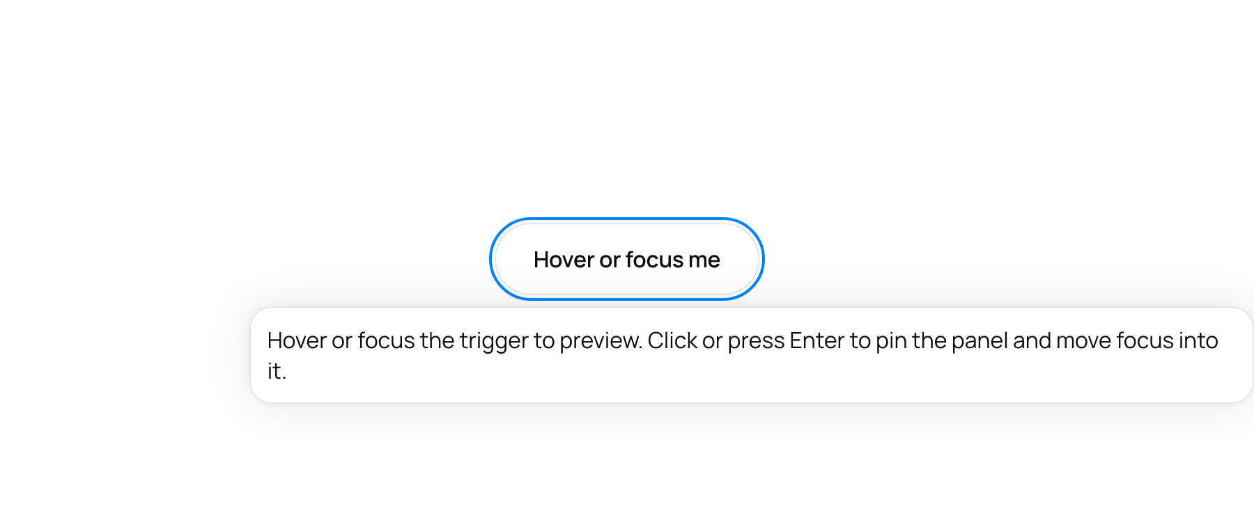
X-1: Nested DarkThemeProvider on a light page: card text keeps the dark-scope colour.
X-6: At 375px, after scrolling, the body rows slide under the pinned title and Close.
O-13: Same look when open, but the list is now a portaled, focus-trapped dialog, so a Modal card cannot clip it.
Before
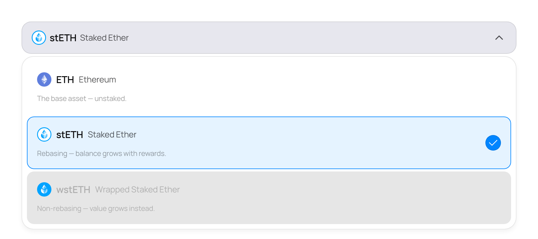
After
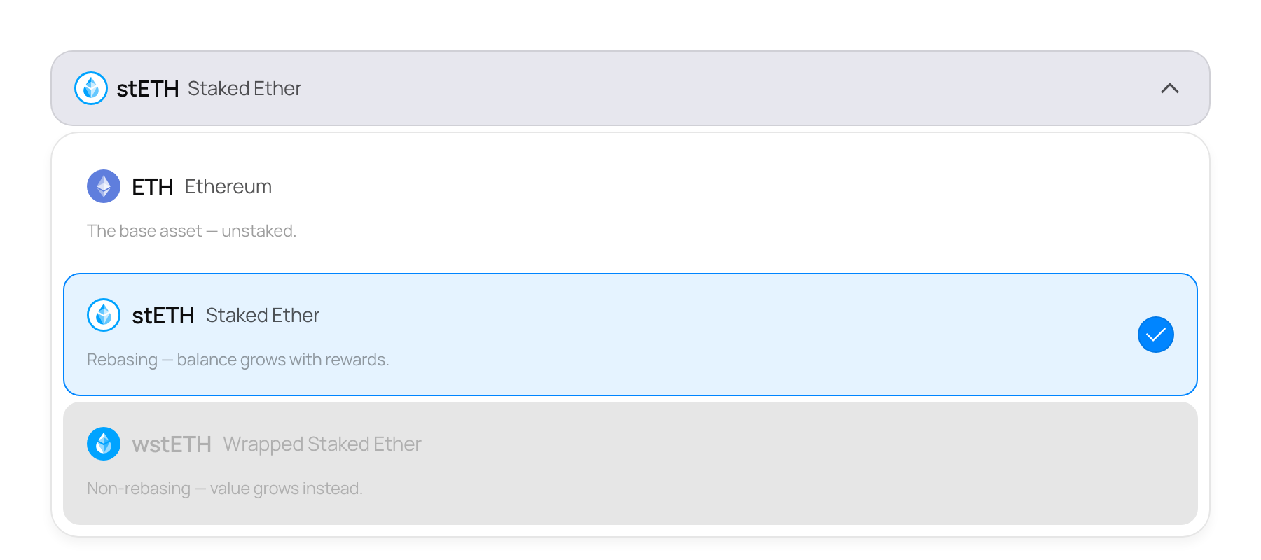
O-21, B-1: Nested modals: Escape closes only the inner one, and scroll stays locked until the last closes.
Stack 4/7.