
Overlays suck, but if you need one, consider using Parvus. Parvus is an open source, dependency free image lightbox with the goal of being accessible.
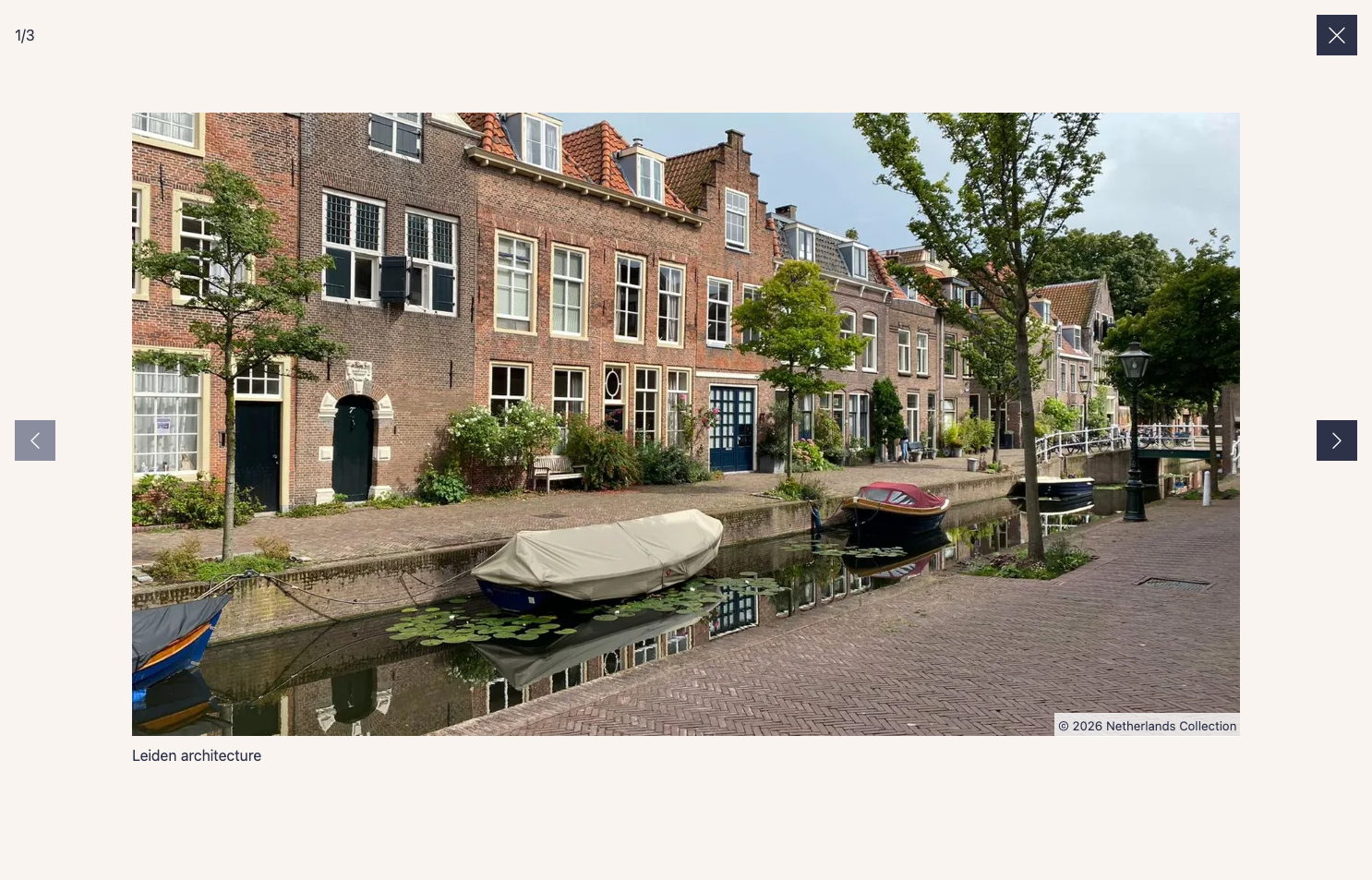
- CSS:
dist/css/parvus.min.css(minified) ordist/css/parvus.css(un-minified)
- JavaScript:
dist/js/parvus.min.js(minified) ordist/js/parvus.js(un-minified)
Link the .css and .js files in your HTML:
<!DOCTYPE html>
<html lang="en">
<head>
  <meta charset="UTF-8">
  <meta name="viewport" content="width=device-width, initial-scale=1">
  <title>Page title</title>

  <!-- CSS -->
  <link href="path/to/parvus.min.css" rel="stylesheet">
</head>
<body>
  <!-- HTML content -->

  <!-- JS -->
  <script src="path/to/parvus.min.js"></script>
</body>
</html>You can also install Parvus using npm or yarn:
npm install parvusor
yarn add parvusAfter installation, import Parvus into your JavaScript codebase:
import Parvus from 'parvus'Be sure to include the corresponding SCSS or CSS file.
Link a thumbnail image with the class lightbox to a larger image:
<a href="path/to/image.jpg" class="lightbox">
  <img src="path/to/thumbnail.jpg" alt="">
</a>
Initialize the script:
const prvs = new Parvus()Caution
By default, captions are inserted as plain text. Set the allowHTML option to true to render them as HTML. If you do this and any of the content is user-generated (e.g., CMS fields or uploads), sanitize it on the server before it reaches these attributes or elements. Otherwise, you risk cross-site scripting (XSS).
There are three ways to add a caption to an image:
You can add an ID to your caption element and reference it from the trigger element using the data-caption-id attribute.
<figure>
  <a href="path/to/image.jpg" class="lightbox" data-caption-id="caption-1">
    <img src="path/to/thumbnail.jpg" alt="">
  </a>

  <figcaption id="caption-1">
    I'm a caption, and I live outside the link.
  </figcaption>
</figure>You can add a data-caption attribute directly to the trigger element.
<a href="path/to/image.jpg" class="lightbox" data-caption="I'm a simple caption">
  <img src="path/to/thumbnail.jpg" alt="">
</a>Alternatively, set the option captionsSelector to select a caption from a child element's innerHTML.
<a href="path/to/image.jpg" class="lightbox">
  <figure class="figure">
    <img src="path/to/thumbnail.jpg" alt="">

    <figcaption class="figure__caption">
      I'm a caption inside a child element
    </figcaption>
  </figure>
</a>
const prvs = new Parvus({
captionsSelector: '.figure__caption',
})Caution
By default, copyright is inserted as plain text. Set the allowHTML option to true to render them as HTML. If you do this and any of the content is user-generated (e.g., CMS fields or uploads), sanitize it on the server before it reaches these attributes or elements. Otherwise, you risk cross-site scripting (XSS).
There are three ways to add copyright information to an image:
You can add an ID to your copyright element and reference it from the trigger element using the data-copyright-id attribute.
<a href="path/to/image.jpg" class="lightbox" data-copyright-id="copyright-1">
  <img src="path/to/thumbnail.jpg" alt="">
</a>

<small id="copyright-1" hidden>
  © 2026 Photographer Name
</small>You can add a data-copyright attribute directly to the trigger element.
<a href="path/to/image.jpg" class="lightbox" data-copyright="© 2026 Photographer Name">
  <img src="path/to/thumbnail.jpg" alt="">
</a>Alternatively, set the option copyrightSelector to select a copyright from a child element's innerHTML.
<a href="path/to/image.jpg" class="lightbox">
  <figure class="figure">
    <img src="path/to/thumbnail.jpg" alt="">

    <small class="figure__copyright">
      © 2026 Photographer Name
    </small>
  </figure>
</a>
const prvs = new Parvus({
copyrightSelector: '.figure__copyright',
})To group related images into a set, add a data-group attribute:
<a href="path/to/image.jpg" class="lightbox" data-group="Berlin">
  <img src="path/to/thumbnail.jpg" alt="">
</a>

<a href="path/to/image_2.jpg" class="lightbox" data-group="Berlin">
  <img src="path/to/thumbnail_2.jpg" alt="">
</a>

//...

<a href="path/to/image_8.jpg" class="lightbox" data-group="Kassel">
  <img src="path/to/thumbnail_8.jpg" alt="">
</a>
Alternatively, set the option gallerySelector to group all images with a specific class within a selector:
<div class="gallery">
  <a href="path/to/image.jpg" class="lightbox">
    <img src="path/to/thumbnail.jpg" alt="">
  </a>

  <a href="path/to/image_2.jpg" class="lightbox">
    <img src="path/to/thumbnail_2.jpg" alt="">
  </a>

  // ...
</div>
const prvs = new Parvus({
gallerySelector: '.gallery',
})Set the root option (element or selector string) to scope an instance to a specific container instead of the whole document, e.g. to run independent instances per view in a single-page application:
const prvsA = new Parvus({
  selector: '.lightbox',
  root: document.querySelector('#view-a'),
})

const prvsB = new Parvus({
  selector: '.lightbox',
  root: '#view-b',
})
Call destroy() when a container is removed (e.g. on route change) to clean up its listeners.
Specify different image sources and sizes using the data-srcset and data-sizes attributes:
<a href="path/to/image.jpg" class="lightbox"

data-srcset="path/to/small.jpg 700w,
             path/to/medium.jpg 1000w,
             path/to/large.jpg 1200w"

data-sizes="(max-width: 75em) 100vw,
            75em"
>
  <img src="path/to/thumbnail.jpg" alt="">
</a>Import the language module and set it as an option for localization:
import de from 'parvus/src/l10n/de'

const prvs = new Parvus({
  l10n: de
})Customize Parvus by passing an options object when initializing:
const prvs = new Parvus({
  // Clicking outside does not close Parvus
  docClose: false
})
Available options include:
{
  // Selector for elements that trigger Parvus
  selector: '.lightbox',

  // Selector for a group of elements combined as a gallery, overrides the `data-group` attribute.
  gallerySelector: null,

  // Element (or selector string) to search within for `selector`/`gallerySelector` matches, instead of the whole document
  root: document,

  // Display zoom indicator
  zoomIndicator: true,

  // Display captions if available
  captions: true,

  // Selector for the element where the caption is displayed; use "self" for the `a` tag itself.
  captionsSelector: 'self',

  // Attribute to get the caption from
  captionsAttribute: 'data-caption',

  // Display copyright if available
  copyright: true,

  // Selector for the element where the copyright is displayed; use "self" for the `a` tag itself.
  copyrightSelector: 'self',

  // Attribute to get the copyright from
  copyrightAttribute: 'data-copyright',

  // Render captions/copyright as HTML instead of plain text; only enable this for trusted content
  allowHTML: false,

  // Clicking outside closes Parvus
  docClose: true,

  // Close Parvus by swiping up/down
  swipeClose: true,

  // Accept mouse events like touch events (click and drag to change slides)
  simulateTouch: true,

  // Touch dragging threshold in pixels
  threshold: 50,

  // Hide browser scrollbar
  hideScrollbar: true,

  // Icons
  lightboxIndicatorIcon: '<svg xmlns="http://www.w3.org/2000/svg" viewBox="0 0 24 24" aria-hidden="true" focusable="false"><path d="M8 3H5a2 2 0 00-2 2v3m18 0V5a2 2 0 00-2-2h-3m0 18h3a2 2 0 002-2v-3M3 16v3a2 2 0 002 2h3"/></svg>',
  previousButtonIcon: '<svg xmlns="http://www.w3.org/2000/svg" viewBox="0 0 24 24" aria-hidden="true" focusable="false"><path stroke="none" d="M0 0h24v24H0z"/><polyline points="15 6 9 12 15 18" /></svg>',
  nextButtonIcon: '<svg xmlns="http://www.w3.org/2000/svg" viewBox="0 0 24 24" aria-hidden="true" focusable="false"><path stroke="none" d="M0 0h24v24H0z"/><polyline points="9 6 15 12 9 18" /></svg>',
  closeButtonIcon: '<svg xmlns="http://www.w3.org/2000/svg" viewBox="0 0 24 24" aria-hidden="true" focusable="false"><path d="M18 6L6 18M6 6l12 12"/></svg>',

  // Localization of strings
  l10n: en
}Parvus provides the following API functions:
| Function | Description |
|---|---|
open(element) |
Open the specified element (DOM element) |
close() |
Close Parvus, returns false if it was already closed or a beforeClose hook canceled it |
previous() |
Show the previous image |
next() |
Show the next image |
select(index) |
Select a slide with the specified index (integer); throws if closed, already selected, or out of range |
add(element) |
Add the specified element (DOM element) |
remove(element) |
Remove the specified element (DOM element) |
destroy() |
Destroy Parvus |
isOpen() |
Check if Parvus is currently open |
currentIndex() |
Get the index of the currently displayed slide |
use(plugin, options) |
Register a plugin |
addHook(hookName, callback) |
Add a hook callback |
removeHook(hookName, callback) |
Remove a hook callback |
getPlugins() |
Get list of successfully installed plugins |
Bind and unbind events using the .on() and .off() methods:
const prvs = new Parvus()

const listener = () => {
  console.log('eventName happened')
}

// Bind event listener
prvs.on(eventName, listener)

// Unbind event listener
prvs.off(eventName, listener)
Available events:
| eventName | Description |
|---|---|
open |
Triggered after Parvus has opened |
select |
Triggered when a slide is selected |
close |
Triggered after Parvus has closed |
destroy |
Triggered after Parvus has destroyed |
Parvus supports a plugin system that allows you to extend its functionality.
To use a plugin, call the .use() method after initialization:
import Parvus from 'parvus'
import MyPlugin from './my-plugin.js'

const prvs = new Parvus()

// Register plugin
prvs.use(MyPlugin, {
  // Plugin-specific options
  option1: 'value1',
  option2: 'value2'
})
A duplicate plugin name is ignored, with a warning logged to the console.
A plugin is an object with a name and an install function:
const MyPlugin = {
  name: 'MyPlugin',

  install(parvus, options = {}) {
    // Plugin initialization code
    console.log('Plugin installed with options: ', options)
  }
}

export default MyPlugin
install receives a context object (parvus in the example above), not the full Parvus instance:
| Property | Description |
|---|---|
state |
The internal application state |
config |
The merged configuration options |
addHook(hookName, callback) |
Add a hook callback (see Plugin Hooks) |
removeHook(hookName, callback) |
Remove a hook callback |
on(eventName, callback) |
Bind one of the events (e.g. to clean up on destroy) |
off(eventName, callback) |
Unbind an event bound with on |
select(index) |
Select a slide with the specified index (integer); throws if closed, already selected, or out of range |
previous() |
Show the previous slide |
next() |
Show the next slide |
currentIndex() |
Get the index of the currently displayed slide |
add(element) |
Add the specified element (DOM element) |
remove(element) |
Remove the specified element (DOM element) |
open(element) |
Open the specified element (DOM element) |
close() |
Close Parvus, returns false if it was already closed or a beforeClose hook canceled it |
isOpen() |
Check if Parvus is currently open |
state exposes the full internal state, but only the following fields are considered part of the plugin API and are kept stable across minor versions. Everything else on state is an implementation detail and may change without notice:
| Field | Description |
|---|---|
state.lightbox |
The lightbox <dialog> element |
state.toolbar / state.toolbarLeft / state.toolbarRight |
The toolbar and its left/right item containers |
state.controls |
The controls container (close/previous/next buttons) |
state.previousButton / state.nextButton / state.closeButton |
The control buttons |
state.counter |
The slide counter element |
state.currentIndex |
The index of the currently displayed slide |
state.activeGroup |
The ID of the currently active group |
state.GROUPS[groupId] |
A group's triggerElements, sliderElements and contentElements arrays, keyed by group ID (e.g. state.activeGroup, or a hook's group field) |
triggerElements are the elements documented in Usage — read href/data-target for the full image, and the <img>/data-alt/data-caption*/data-copyright* attributes for anything else about them.
Plugins can hook into various lifecycle events:
| Hook Name | When Triggered | Provided Data |
|---|---|---|
afterInit |
After lightbox DOM is created (once) | { state } |
beforeOpen |
Before Parvus opens | { element, group, index, state } |
afterOpen |
After lightbox opens | { element, group, index, state } |
beforeClose |
Before Parvus closes | { group, index, state } |
afterClose |
After lightbox closes | { group, index, state } |
beforeSlideChange |
Before slide changes | { index, oldIndex, group, state } |
slideChange |
When slide changes | { index, oldIndex, group, state } |
elementAdded |
After an element is added via add() (also once per element during init) |
{ element, group, index, state } |
elementRemoved |
After an element is removed via remove() |
{ element, group, index, state } |
imageLoad |
After a slide's image finished loading or failed (including preloaded slides) | { index, element, success, group, state } |
For the before* hooks, a callback returning false cancels the action. These hooks are synchronous — a returned Promise does not cancel anything.
Internal corrections bypass the before* hooks: remove() always closes when a group's last slide is removed, and always re-indexes when the displayed slide is removed.
elementAdded/elementRemoved only fire for calls made after the hook is registered. For the current membership, read state.GROUPS directly during install().
Example using hooks:
const MyPlugin = {
  name: 'MyPlugin',

  install(parvus, options) {
    // Add a custom button on init
    parvus.addHook('afterInit', ({ state }) => {
      const btn = document.createElement('button')

      btn.classList.add('parvus__btn')
      btn.classList.add('parvus__btn--my-plugin')
      btn.textContent = 'Custom'
      btn.type = 'button'

      // Add to controls as first element
      if (state.controls) {
        state.controls.prepend(btn)
      }
    })

    // Track slide changes
    parvus.addHook('slideChange', ({ index, oldIndex }) => {
      console.log(`Changed from slide ${oldIndex} to ${index}`)
    })
  }
}Parvus is supported on the latest versions of the following browsers:
- Chrome
- Edge
- Firefox
- Safari